

Weekly S&P500 ChartStorm - 10 September 2022
Weekly S&P500 ChartStorm - 10 September 2022
This week: technical check, put buying, SPACs, wealth creation/destruction, recession, interest rates and the stockmarket, valuations, buybacks vs issuance, and IPO market indicator...

Welcome to the Weekly S&P500 #ChartStorm — a selection of 10 charts which I hand pick from around the web and post on Twitter.
These charts focus on the S&P500 (US equities); and the various forces and factors that influence the outlook - with the aim of bringing insight and perspective.
Hope you enjoy!
NEW: Sign up to the (free) Chart Of The Week over at the new Topdown Charts Substack entry-level service: Subscribe to the Chart of the Week
Each week we send you one of the most interesting charts on our radar, along with commentary/context and a key takeaway — so you’re never left guessing on why the chart matters ...and the charts matter! > > > Subscribe Now
1. Lining Up: These are the lines that matter most.
There are a few things I would note on this: first, these are indeed the lines in the sand, and once either one of these lines gets broken then that will most likely define the market regime going forward (bear vs bull). The other thing is, aside from a breakout or a breakdown, “something else“ is always an option! (life tends to be messier than the textbook!) In that sense, we could easily see a rally up to the top end before a dip back down to the bottom end, just to add to the suspense.
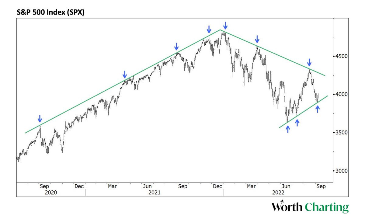
Source: @CarterBWorth
2. Institutional Intrigue: Institutional investors are scrambling and can't get their hands on enough put options... is this simply backwards looking reaction (falling prey to the same psychological foibles that plague individual investors)? or prescience?

Source: @investor743
3. Put Premium Profusion: Another angle on the insto put-rush... someone(s) taking out a major bet on a market crash!
(albeit the optimistic take would be that the insto(s) doing this are actually heavily risk-on, maybe even establishing new longs, and just want a safety harness in the form of put protection)
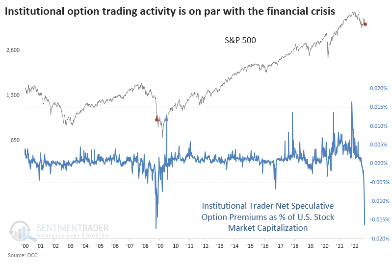
Source: @sentimentrader via @TheShortBear
4. SPAK OFF: SPACs were probably the most blatant symbol and symptom of the liquidity tidal wave the swept across markets in the wake of the pandemic. True frenzy.
And now the SPAC ETFs are being delisted.
Bottom or not, it tells you a lot.
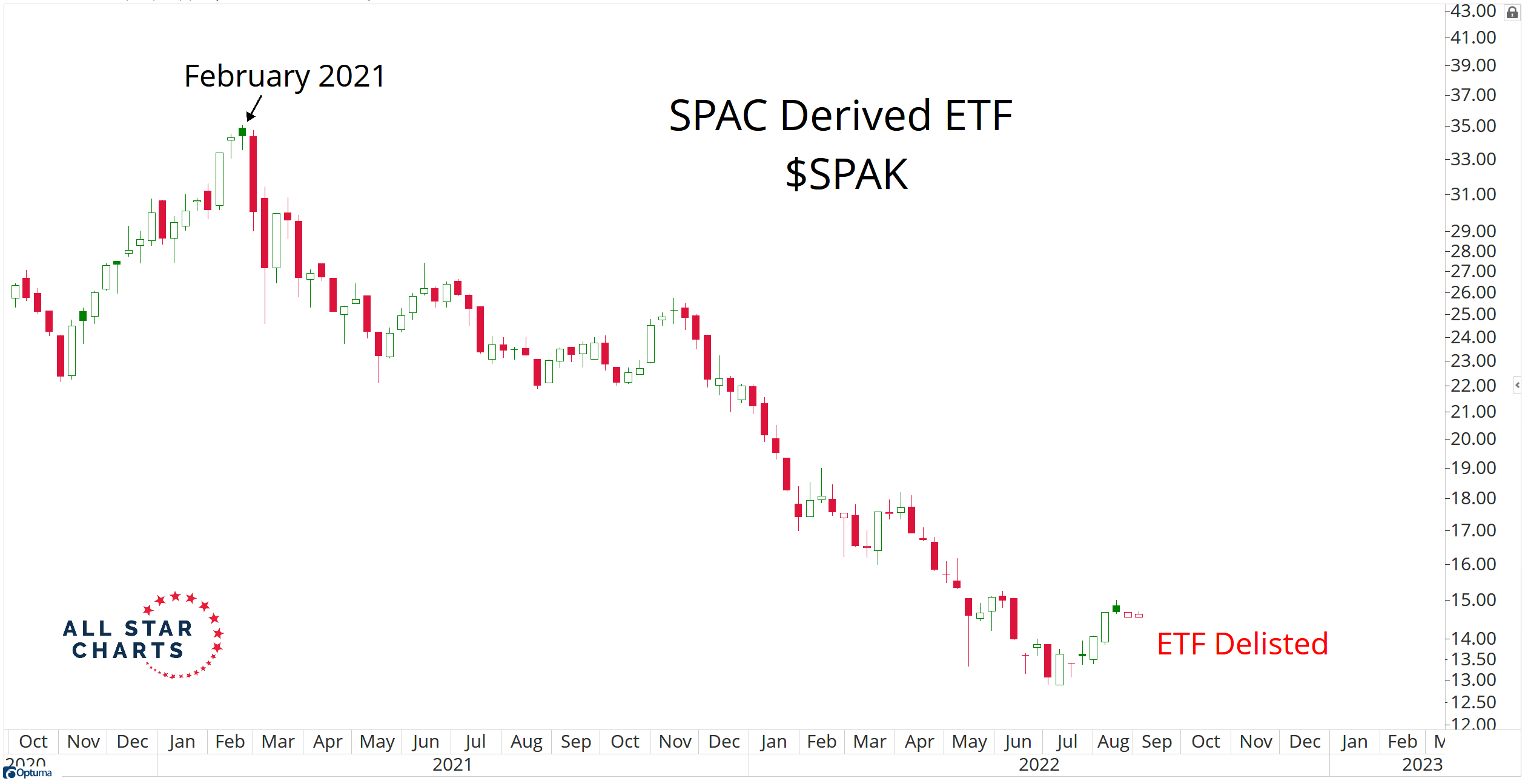
Source: Chart Of The Day: SPAC ETF Delisted
5. Wealth Destruction: The central banks giveth. The central banks taketh.
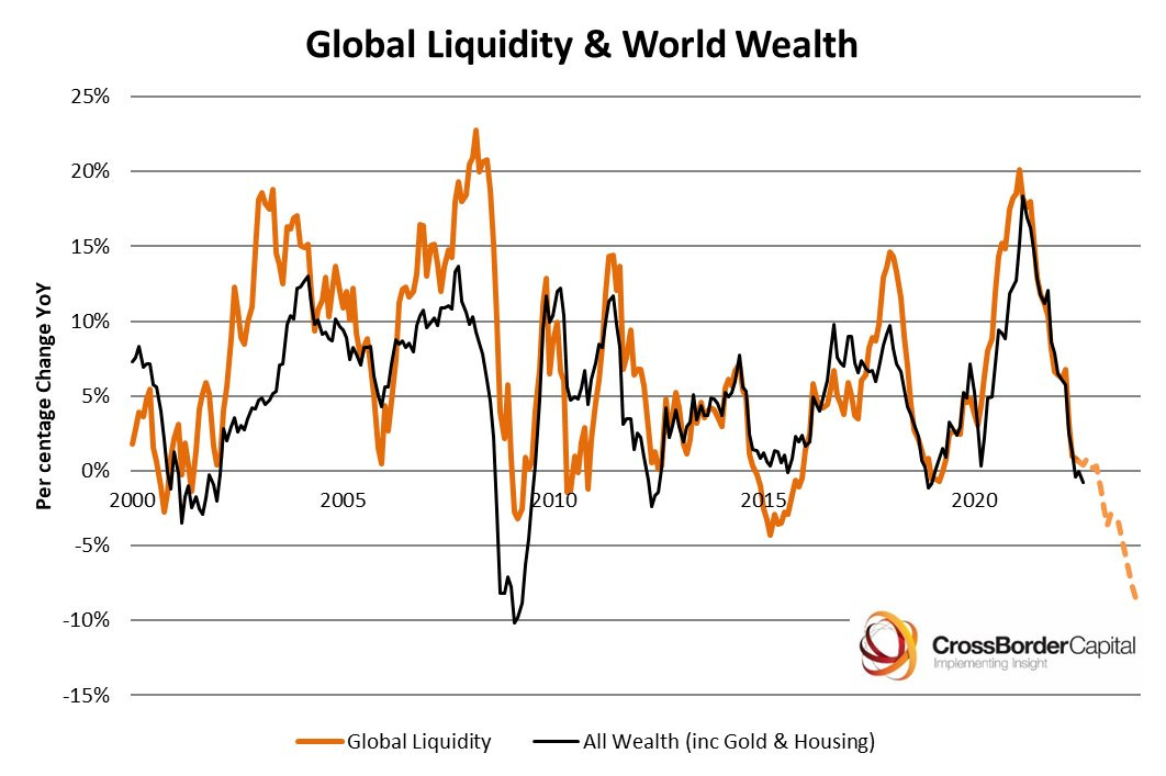
Source: @crossbordercap
6. Recession Talk: There are more companies talking about recession during earnings calls than during the depths of the pandemic panic.
Interestingly, those most vocal are Financials, Real Estate, Materials, Energy (i.e. the sectors traditionally most exposed to the economic cycle).
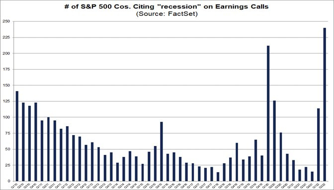
Source: @FactSet via @InvestmentTalkk
7. Fed Market Bottoms: Historically most bear markets needed rate cuts to sustainably bottom (and in at least a few instances needed a lot of rate cuts). Something to be mindful of when you consider that the Fed is still talking up further rate hikes, and is likely still a long way off pausing let alone pivoting to cuts.
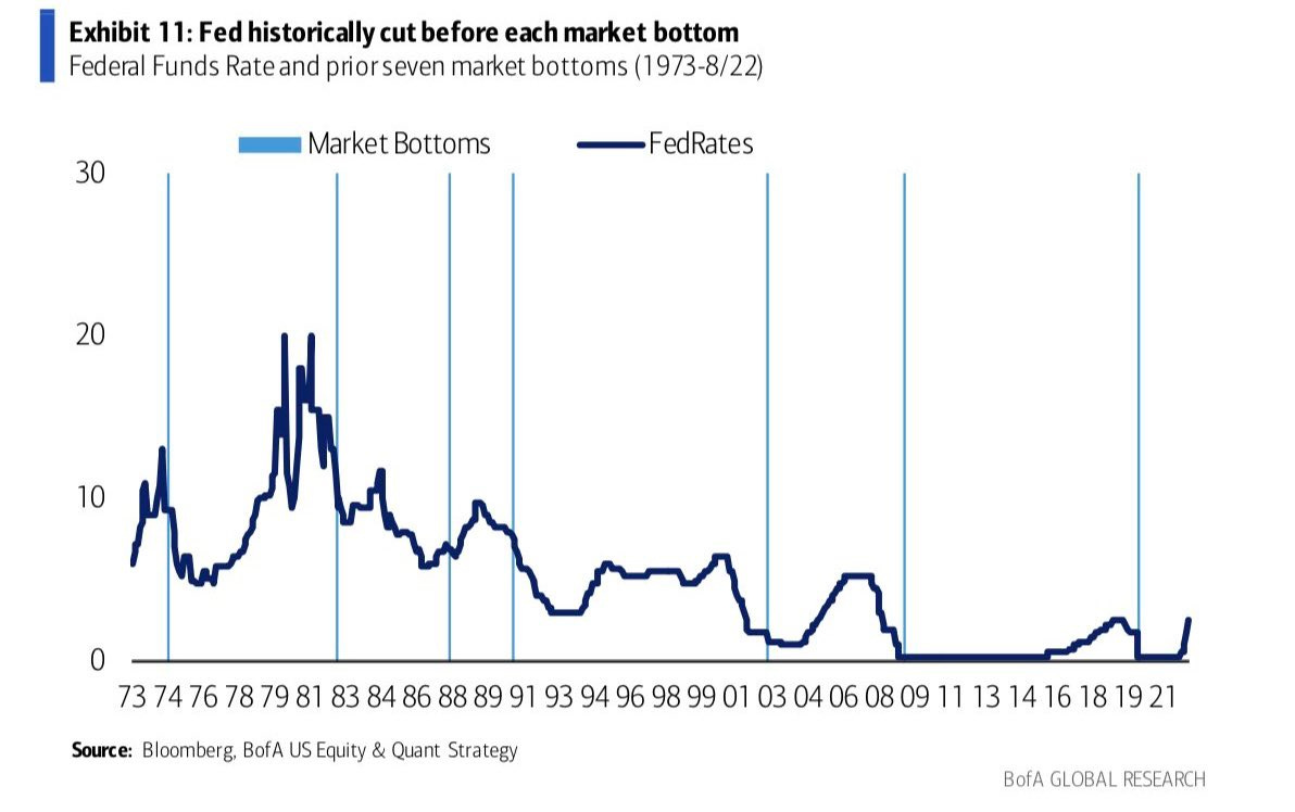
Source: @Marlin_Capital
8. Interest Rates and Earnings Yields: Interest rates go up = earnings yield go up.
(n.b. earnings yield = inverse of the PE ratio, so rates go up = valuations go down... aka “don't fight the Fed”)
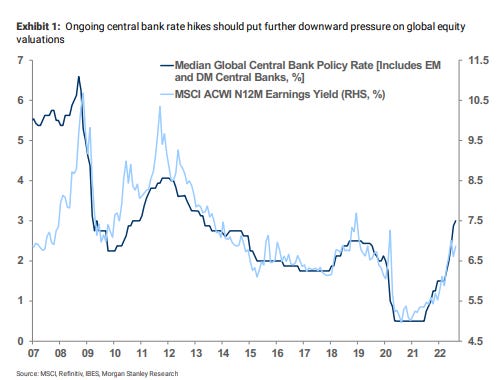
Source: @beursanalist
9. Valuations: On a forward PE ratio basis (and again, we do need to be mindful that the forward estimates may fall and may be overestimating things if recession hits), US equities are in line with recent history average (but not cheap/below average). Whereas the rest of the world does look cheap vs its own history (and vs USA).
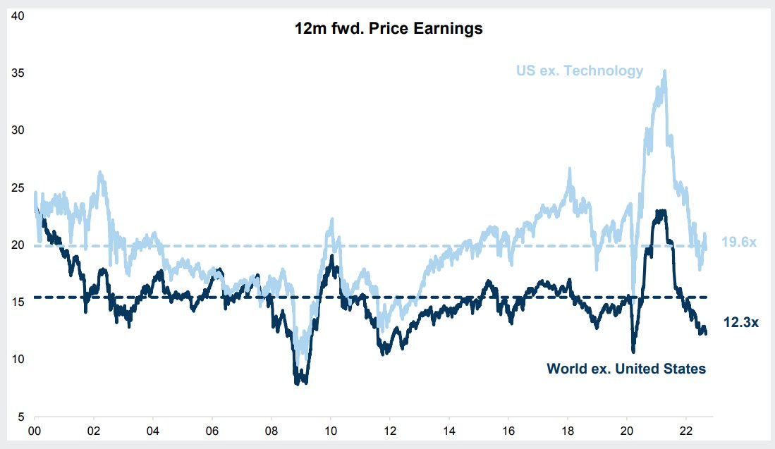
Source: @QCompounding
10. Buybacks vs Issuance: For most of history companies that Bought Back shares consistently beat those that Issued shares. Of course this is probably more of a symptom than a cause (companies that are generating excess cash flow can distribute vs companies that are deficient in funding/cashflow need to raise).
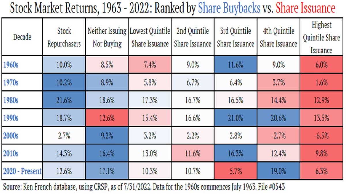
Source: @JeffWeniger
Thanks for following, I appreciate your interest!
BONUS CHART >> got to include an extra goody for the goodies who subscribed.
IPO Boom-Bust-Bottom Indicator: after peaking in early 2021, the previously booming IPO (and SPAC) market has turned to bust. But that may not necessarily be a bad thing…

Historically the cycles of boom and bust in the IPO market have mapped fairly well to the cycles of bull and bear in the stockmarket.
The chart above tracks the rolling quarterly number of IPOs standardized against the total number of listed companies.
Like a lot of market timing indicators, it doesn’t do a great job of picking the top in the market, but it does appear to do a decent job of identifying market bottoms.
Basically when this indicator plunges towards 0%, that has historically been a sign that a bottom is close. It should be noted that there are a few occasions where this signal was early, as well as instances where it went really low, and then kept going lower!
But what is the logic? (a question that you should always be asking when presented with any indicator that purports to signal a certain thing)
A few points: IPO activity plunges when investor sentiment is bearish (no speculative appetite), when cash and liquidity is tight, when confidence is low, and sales/financial data looks weak (after all you want to IPO when your business looks its best, right?).
In other words, IPO activity dries up at the bottom of the business/market/financial cycle. So it is in that respect simply a symptom of the cycle.
But at the margin, less IPOs also mean less new supply of stocks, and going back to ECON101: if we hold demand constant and then drop supply, price goes up.
So there is some logic to it. Only question now is how early the signal might or might not be this time, and whether this is *the* low point in the indicator…
—
Best regards,
Callum Thomas
My research firm, Topdown Charts, has a new entry-level Substack service, which is designed to distill some of the ideas/themes/charts from the institutional research service to provide the same high quality insights at a more accessible price.
Give it a try and let me know what you think! :-)
Referral Rewards? Refer a Friend to the Weekly ChartStorm… get reward!
Refer 5 people = request a chart
Refer 10 people = get a free trial to Topdown Charts
Refer 25 people = get a free T-Shirt
#2 and #3 on puts really got my attention! Thanks Callum!
cool stuff, Callum.